How to reinvent an economic report?

Every month, my team used to publish an economic report with tens of indicators about small businesses, about our organization, and about the economy as a whole. Since the beginning, we wanted to make it a step further to similar reports, in terms of user experience, even being a PDF file.
We invested some effort into creating a structure of navigation. So, users could easily find their answers.
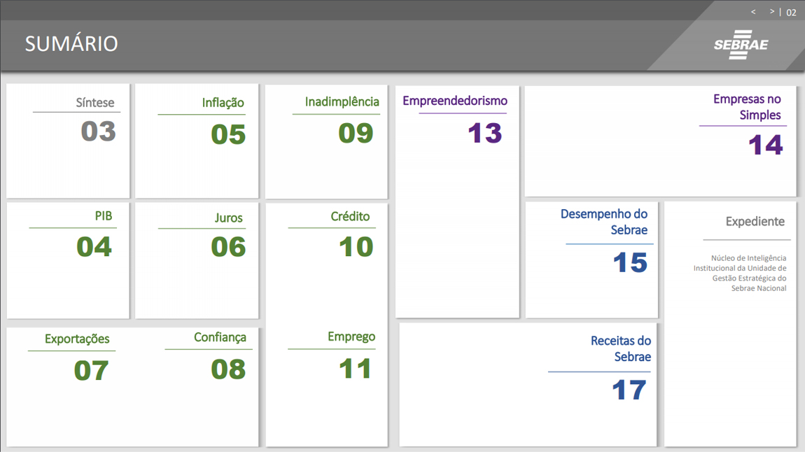
The first thing was to create a blocks-based summary, instead of a usual list of items. It would minimize a common effect we call “wall of wordsâ€, when users try to runaway of the content, because of the high density of words related to options. Doing that, we reduce the density, making the reading and decision more pleasant.

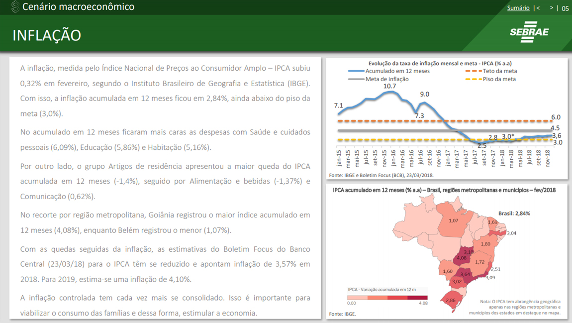
The content pages would also follow certain principles. The first one was at the top. The user can always find 3 links there: previous page, next page and back to the summary. It makes navigation easier.
Finally, the content was arranged inside boxes. It supports a clearer perception of information hierarchy, while brings a sense of digital application albeit in a PDF file.
