How to entirely redesign a complex module of data visualization?
Inside the platform of DataSebrae we have a module called DataSebrae Indicators. In fact, it was how DataSebrae was born, back in 2015. At that moment, we couldn’t work so much on the interface. We had bought a third-party solution, and for a while, we kept the original one, as we considered that to be easy for users. That wasn’t.
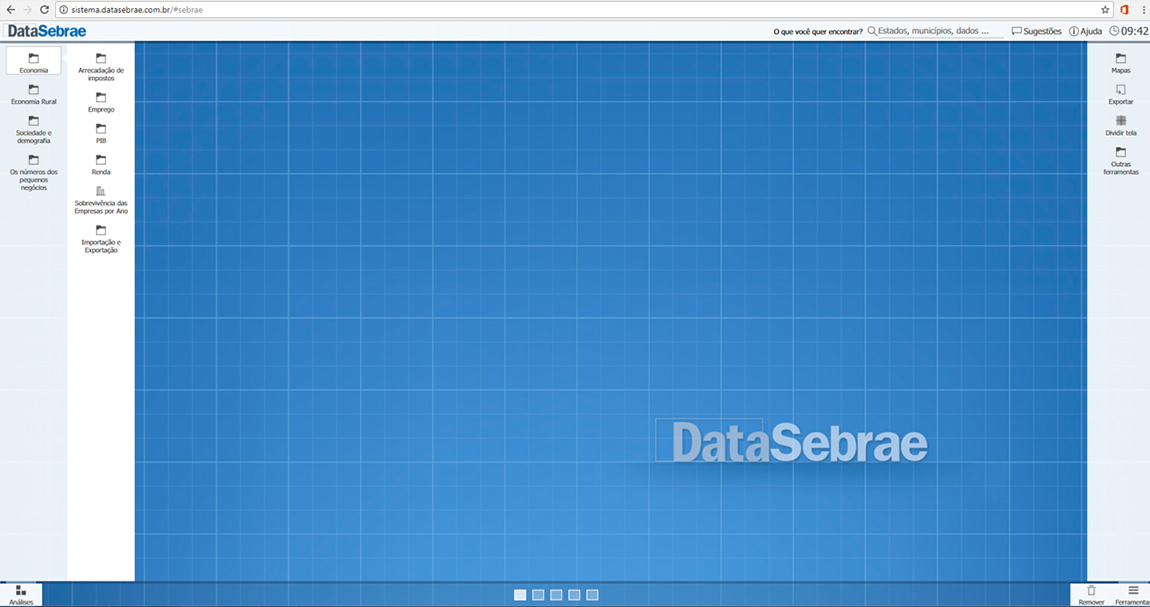
That’s a historical picture of the old version of DataSebrae Indicators. For some reason, we used to share the menu on both sides. It was a manner to split charts and maps, but users couldn’t see that. For them, those menus were supposed to work together, as complementary tools.
The navigation was also confusing. With many different levels of hierarchy in the menu, and unclear labels, the game was all about trial and error. Also, part of the indicators would overlap others.
In 2017, we started a big project of redesign, and diplomacy, since the mentioned third party was still working with us, and we needed them to develop the new version.
Pain points
As you could see, it took some time for us to realize that our system wasn’t that easy, as we imagined. That’s actually pretty common for professionals who are involved in the development, thus we are not the ones who could judge our own usability and experience.
We had 12 volunteers of different ages, genders, and technological backgrounds, but they were all part of our target. They helped us with testing the system, and to do so, we applied some methods of UX research. The idea was to raise all the pain points. It means elements that could injury the experience, or delay the learning curve. We also needed to better understand the mental model of users for the content organization. Here it comes the Architecture of Information.
Ideation
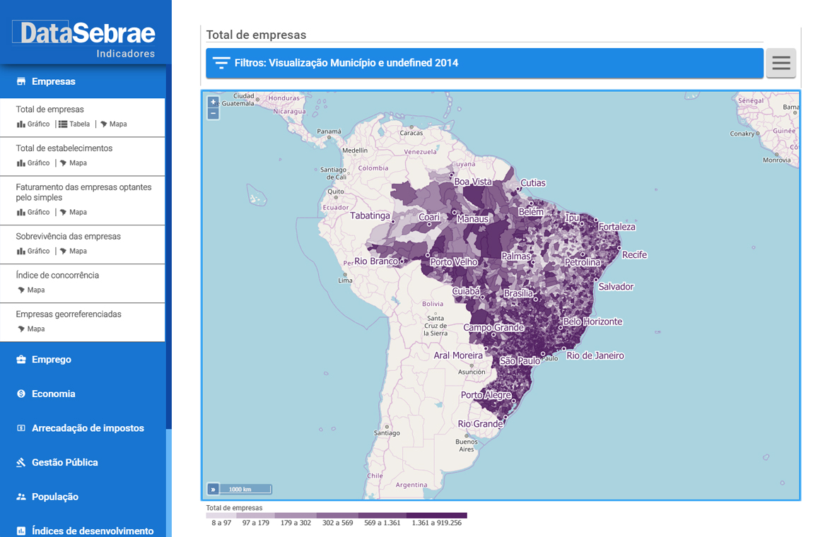
Based on most of the pain points, we created a new design for the interface. Now the menu was one-sided and had clearer labels. To do that, we realized that we needed a bigger number of main categories, 9. Before, they were only 3. The result is less abstraction and more clarity.
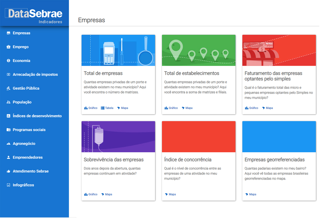
We also started working with cards. After clicking in one of the 9 categories, users could see a bunch of cards, related to an indicator, each. The main reason for that is getting space for communication more with users. We wanted them to stop working by trial and error, so stating precisely what they would find after clicking there is a good option.
Semiotics also plays an important role here. The old version seemed a lot like professional software and users could be intimidated by that appearance. We needed to provide a more “apps-like†interface. The point is, people consider mobile apps easy to use, and making it look like that would reduce the aversion.
To do so, we worked with the principles of material design. This is, probably, the most popular design system for apps, nowadays, referring to this kind of digital resource in users’ minds.
The new version of DataSebrae Indicators was released in August 2017 and was applauded as a great change.