How to display our hundreds of reports about Coronavirus into a single webpage? (And why?)
I work in a company that supports small businesses all over the country. As soon as the Coronavirus pandemic started, we began making researches to measure the impact of this disease on the economy. We also produced weekly reports, with content from all over the world. I’m talking about tens of documents every month. The challenge was to keep them all visible to everyone.
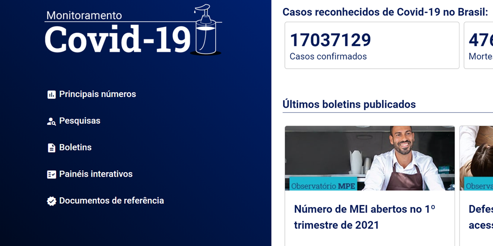
The strategy was to create a single-page application. It would make the navigation through so many reports extremely fast while keeping the highlights for each document.
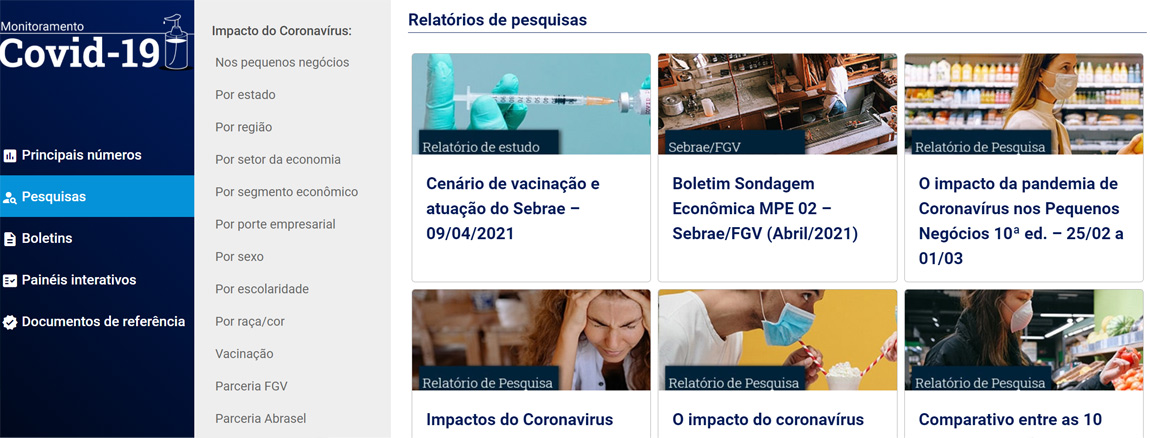
The manner to organize was also a key point. There were 3 main areas: main numbers, reports, and researches, all put in a side menu, that splits itself in a half to present subcategories. After that, each of the reports is shown on a card.
The solution also included the option to subscribe for notifications, only by giving the email. In this case, the number of users surprised us, and the idea will be probably used in other projects.