How to redesign an entire platform of knowledge management?

That’s a secret, we are working to reformulate all the platform of DataSebrae. We already have the plans, but it wasn’t implemented yet. And I will tell you how we are going to change everything.
The problem
The navigation at DataSebrae is not good. At least not anymore. When I designed the current version of the platform, it was much smaller. We only had the module Indicators, something around 30 thematic reports, and 2 or 3 digital libraries.
Soon, it started growing in the number of digital solutions, and even though we are benchmark among portals of information, the structure that I have designed can’t afford good usability.
Solving the problem
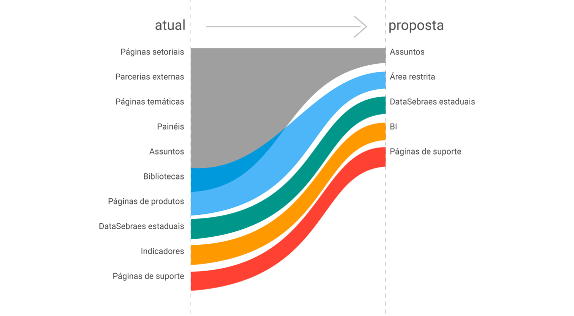
It is not only about changing the menu. We need to rethink all the manner how the content is organized. Based on the data we have collected over the last 2 years on how people interact with DataSebrae, we are simplifying the structural elements. Instead of having 10 different kinds of solutions, we only need 5.
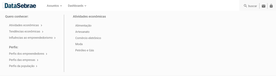
A crucial aspect of the makeover is getting all the content of each subject together. So, users can simply look for subjects, and not subjects inside distinct approaches of information. For example, let’s suppose you need to know about the credit. We have one page of questions and answers, we have interactive panels, and we also have reports. It is all spread through the platform. Now, there will be one special page on credit, and everything can be found there, easily.
In a final instance, the menu will be also simplified. Now, we will have two main buttons. The first one lists the subjects and the second one, the interactive dashboard, for those who still prefer to go deep in the data. Secondary buttons are also in the plans. They will relate to state versions of DataSebrae and restrict areas.