How to redesign the most necessary and most annoying system of our organization?
I work for a very complex organization, considering its rules, controls, and methodologies. Having around 6 thousand effective employees all over the country, we used to have more than 4 thousand ongoing projects. Now, let’s add some ingredients to the mixture: most of our budget comes from public resources, and in fact, we are not only one organization, but 28 independent-but-connected ones.
At this point, it is easy to see that we don’t fit most solutions for management in the market, or at least, we believe in it.
To handle all the 4 thousand projects, through our own and particular rules of budget, project management, and strategy, we needed to create our own system. Something that should be in the routine of 3 thousand professionals, but nobody likes it.
To make a long story short, it was released in a hush only to have something working, while we couldn’t have something better. Here it goes more than 10 years waiting for that something better to come. The premise, in this case, was something like: if people need it, they will use it.
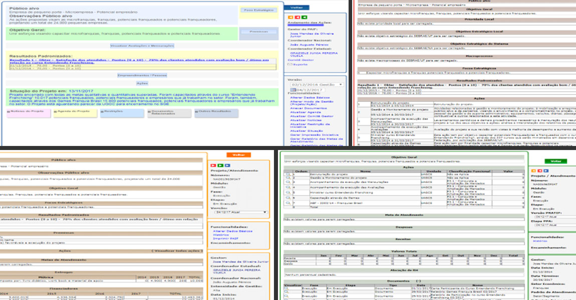
It was divided into many different modules, depending on the moment of the project. Each of these modules had hundreds of screens to be followed. And sometimes, after having filled all the possible blanks, the system would restart from the beginning, as if nothing had happened.
UX Research
I led the redesign of this entire system, having the manager of the system with me. He was the guy who knew everything about it. All the flows and the rules, but more importantly, he was engaged in making a system to be proud of.
For 6 months, we proceeded with different methods of User Experience Research, with users of various roles in project management, and from different regions of Brazil. We raised all the pains and needs.
Redesign
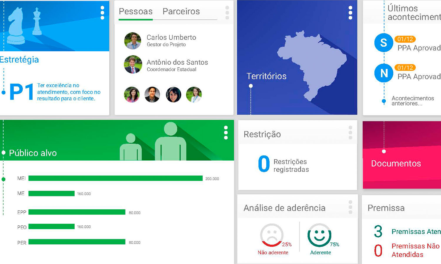
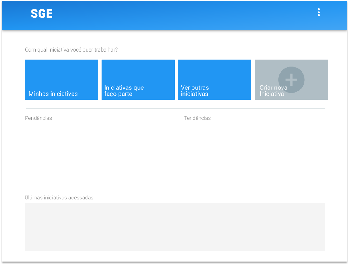
After having a thorough comprehension of the users’ perspective, we proposed a new version for the system. Instead of many different modules with hundreds of screens each, we suggested something with only 2 pages. The first one would be used to find a specific project or create a new one. The other one was a dashboard of the project itself. In this case, every single detail could be managed or monitored there.
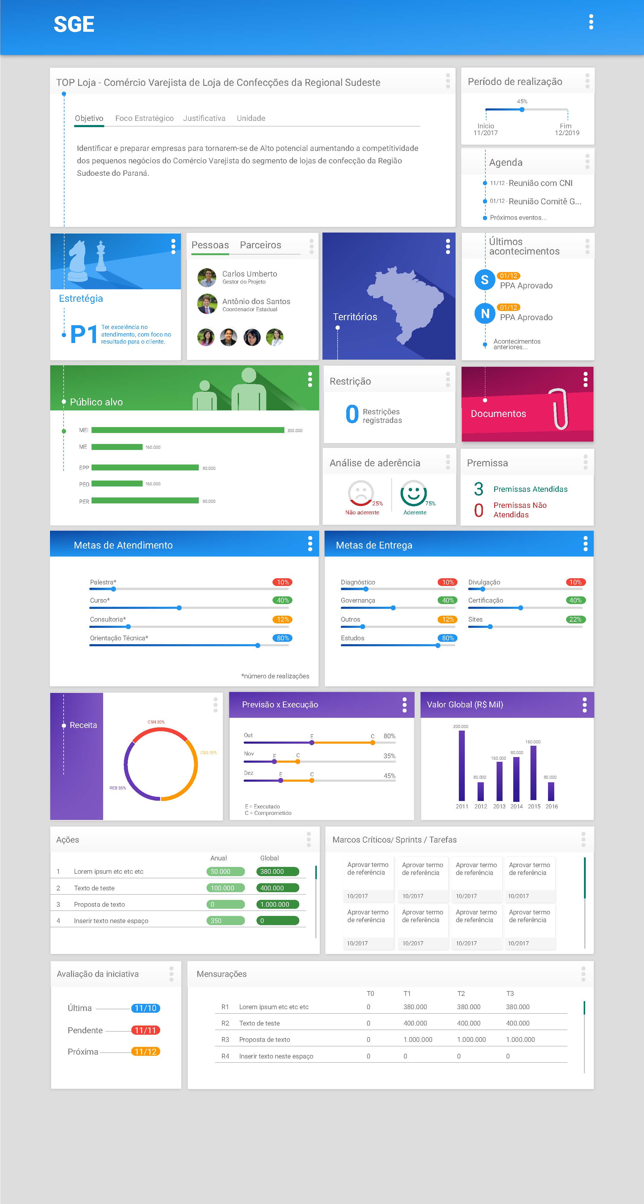
The main elements
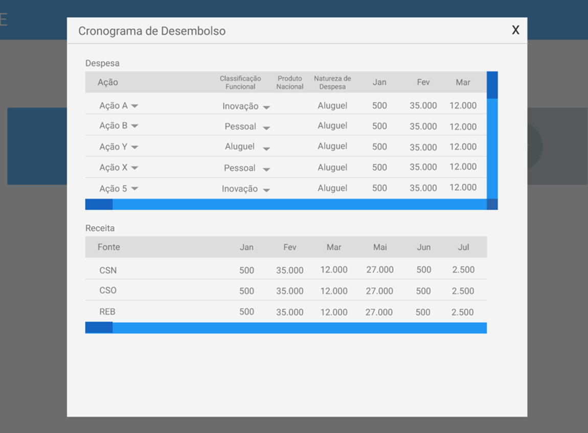
One of the most important elements in our strategy was the use of modal windows. They allow the user to stay on the same screen, while new content or forms are displayed. It requires no time for loading and keeps you always in the same place, so there is no need to chase the right screen, as before.
Doing so, we also eliminated the different modules, based on the moment of each project. We did it by enabling or disabling certain boxes. It means that users can see the elements that they can touch in each moment of the project.
Different roles of the project flow were also considered. Budget managers or strategy managers, for example, could see a task list on the first page. It would indicate the projects to be approved in the moment, while inside the project dashboard, the specific boxes that require some attention are highlighted.