How to present all the main numbers of small businesses in one interactive page?
Since I work for an organization aimed to support small businesses of Brazil, we are always requested to present the numbers that represent the reality of those companies, and more importantly, how relevant they are for the country.
What if we could present all the relevant statistics in an interactive page? We did it. After a creative meeting (which is quite usual for us), I designed and developed a solution that allowed users to handle information in different levels of depth, while the rest of the team would prepare the data to be shown.
3 levels of information
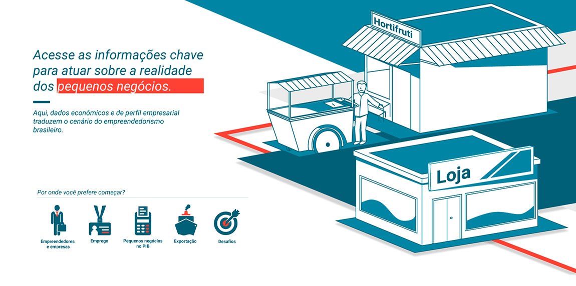
The content would be arranged in 5 different categories: companies and entrepreneurs, employment, small businesses in the economy, exportation, and challenges. So, the question was about organizing all the statistics into these categories, while maintaining the user on the same page. The answer was a model of 3 levels of information depth.
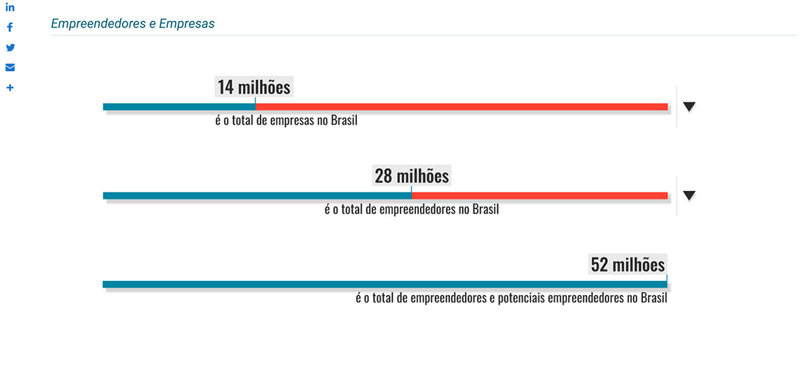
The first level displays all the numbers through progress bar charts. It permits a better awareness of the amounts while summarizing the information at a glance. For example, in the first segment, you immediately see that Brazil has 14 million companies, 28 million entrepreneurs, and 52 million entrepreneurs plus potential entrepreneurs.
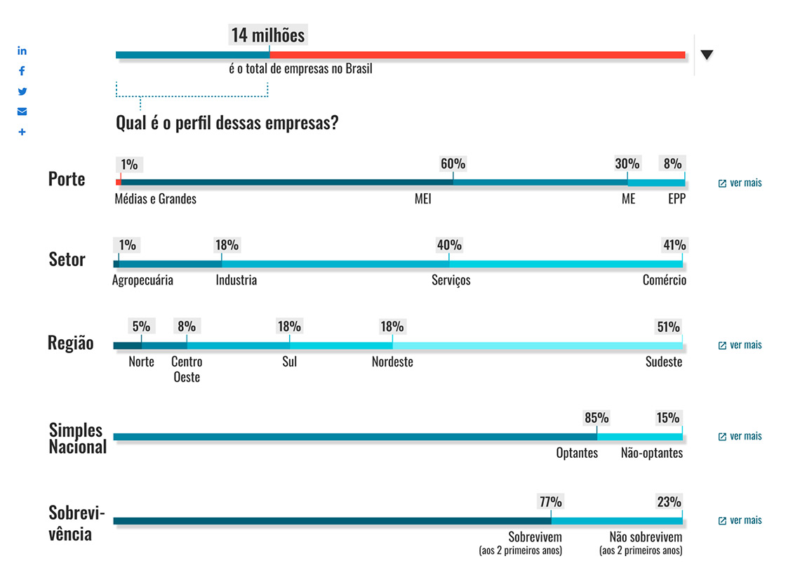
The next level of content is still based on progress bar charts, but more detailed. When the user clicks in the sided arrow, it presents more specific data. The information that Brazil has 14 million companies, for example, opens the statistics about the profile of those companies in size, the economical sector, region, chances of survival, and adherence to the tributary regimen of small businesses.
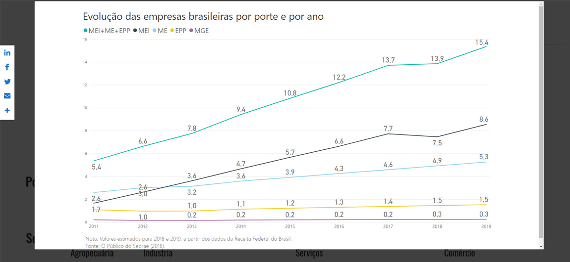
Evidently, the third level is even more specific. Users can click on the “see more†button by side, to see charts or maps related to that information. One of the company sizes, for example, displays a line chart from 2011 until 2019, so users can check the evolution of each group.