How to add relevance and credibility through the visual identity of documents?

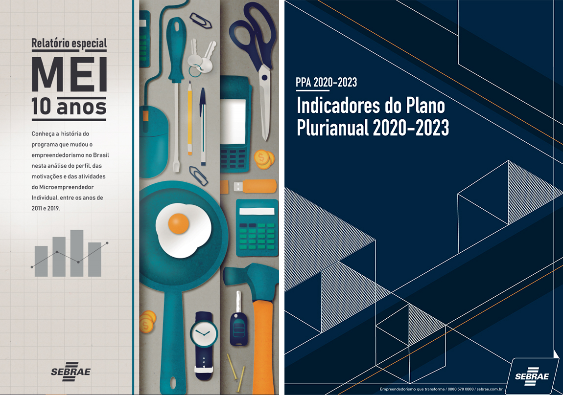
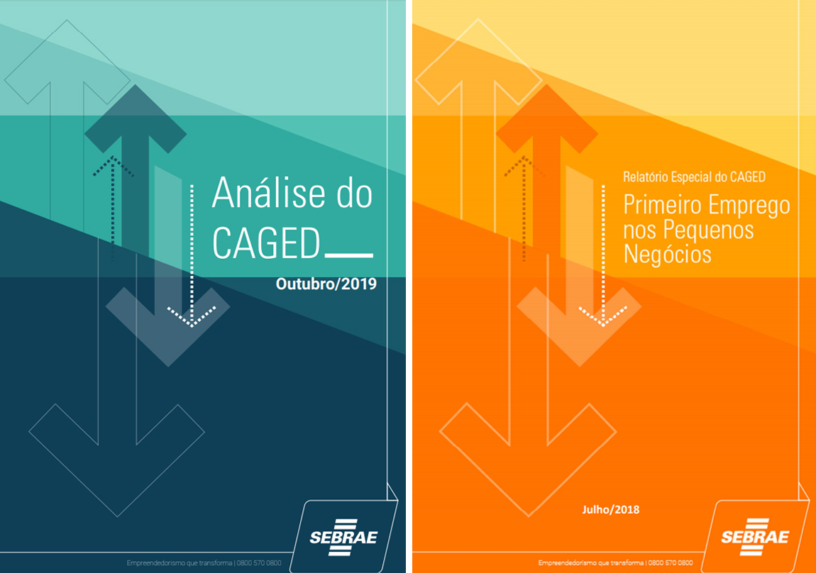
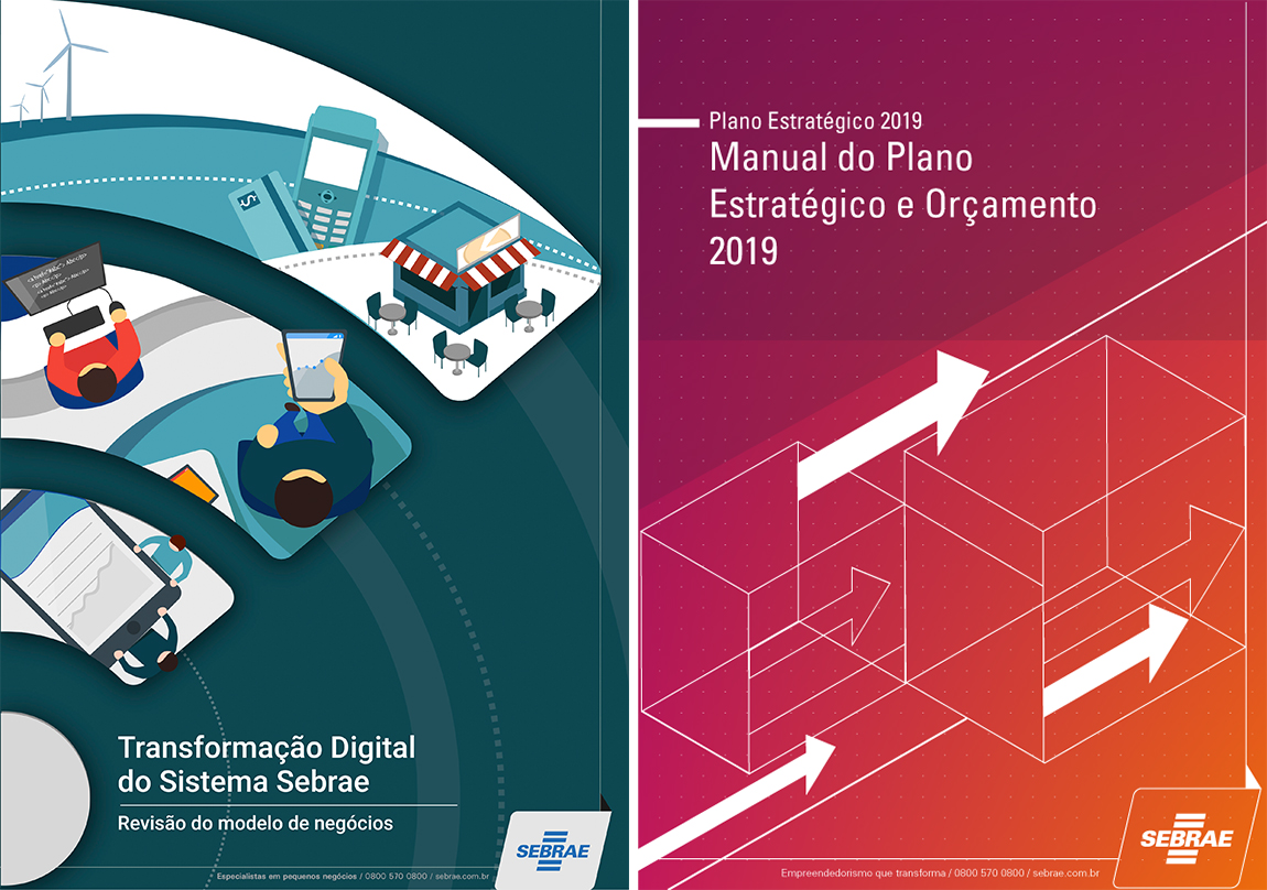
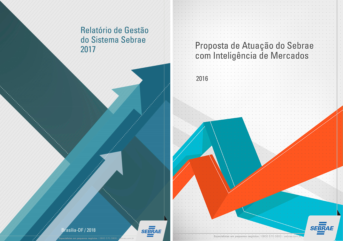
Over the last years, I have been responsible to design the visual identity of the most relevant reports produced by the unit of strategic management of my organization. It might be simple, but I feel pretty satisfied when I’m walking through the organization’s building and I see my work on so many computer screens.
The challenge here is a lot about semiotics. The graphic design is supposed to aggregate relevance and credibility to the documents. Bellow, you can see part of the covers that I designed.


