How to communicate with 3,000 professionals in all over the country?

Imagine an organization with 3 thousand project managers spread in hundreds of cities all over the country. And now, consider the role of the strategic management unit of this same organization: they should keep everyone in the same page, all the time.
This is part of my job, since 2014 when I created a monthly newsletter called Gestão em Foco (Management in Focus). The best thing about it was the scientific approach that we assumed on the production of this vehicle. First, because we needed people to click on it, and also because we needed them to read and assimilate the content. Sounds evident, but most of the channels don’t really have this kind of concern. Maybe that’s why we became a benchmark inside the organization. Let me tell you how we did it.
Metrics
The most elementary thing in a project like this was to have the metrics of the user’s behavior. We needed to know whether managers were clicking and reading our content. We used to analyze the numbers of every article in every edition, never taking results for granted.
In fact, after a long period of success, we realized that the formula was not working anymore, and we could successfully reinvent the vehicle.
Matrix of news value
Since we had metrics, we could work in its growth. So, we added some theory of journalism in it. We found literature on what gets the attention of people to read a news item, and the next step was to create a matrix to evaluate the potential of an article. Basically, we could estimate how many people would click and read something, according to the title and short description. See? Scientific approach again, or, is it a design approach?
Communication design
Our newsletter wasn’t the only one in the organization. When we compared our results to other ones, we could see a huge difference. While we had a well-accepted channel of communication, others could have only a click or two. I believe that part of it is due to the design of our job. First, trying to understand the users that we were trying to connect with, and in a final perspective, the aesthetics and information architecture also counts a lot.
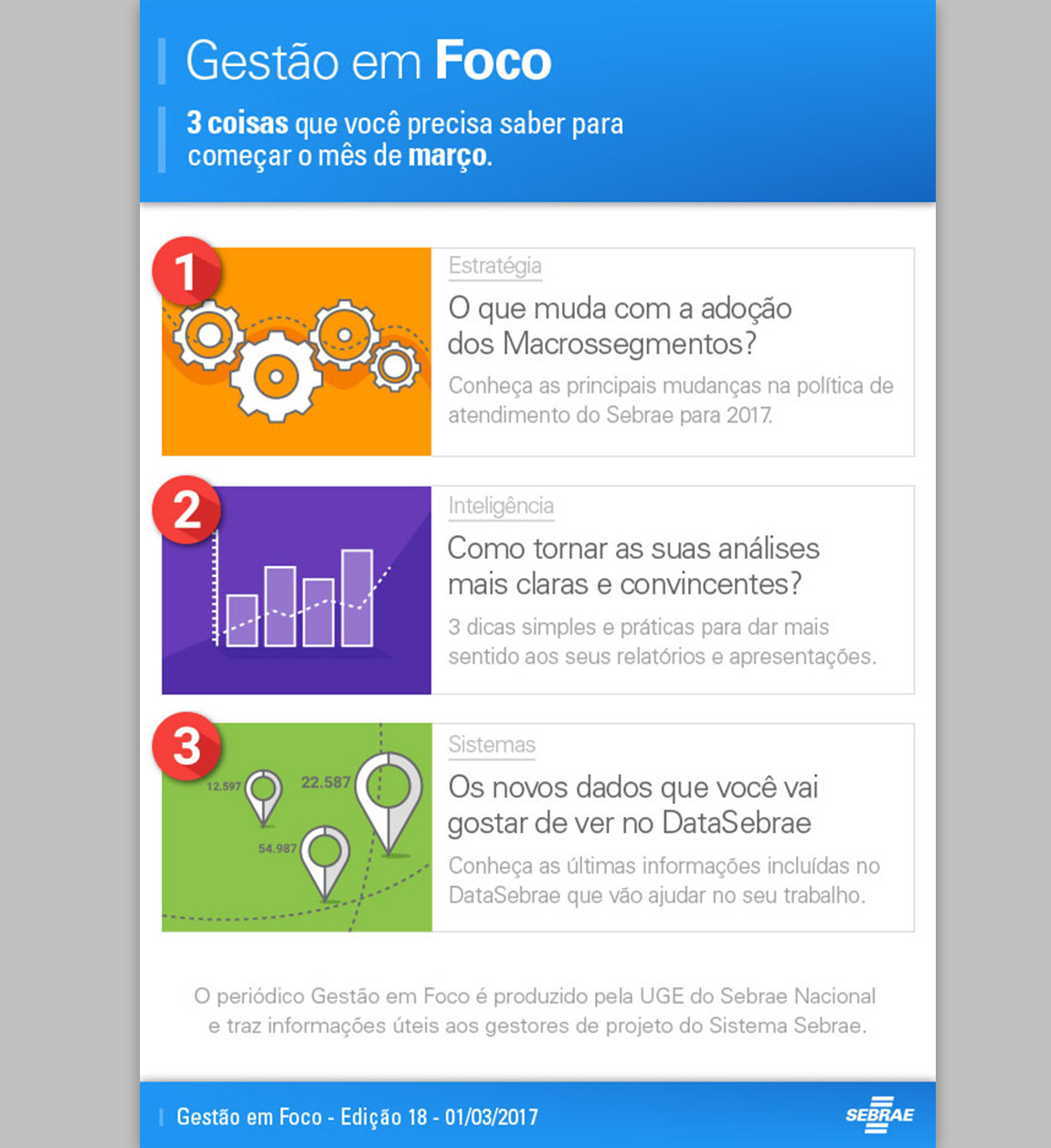
We did something that was carefully thought to be pleasant and comprehensible. Every edition had 3 articles, and they were presented with simple flat design pictures. Unnecessary elements were considered distractive and put out of the game.
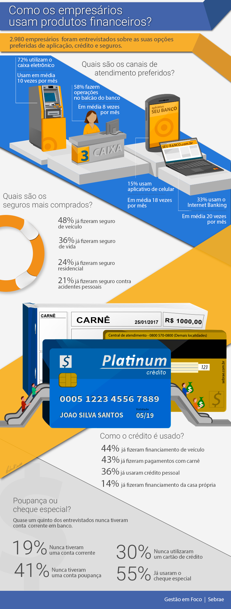
Infographics
Infographics can present tons of information, not missing anything and really increasing comprehension. Can you imagine those airplane safety booklets on how to leave the airplane and float with your seat, without infographics? That wouldn’t be only a booklet.
I’m thankful to Gestão em Foco for most of my skills in creating infographics. Most of the editions had at least one, and this was the best part for many of our readers.