How to prevent users to dig for a simple piece of information?
Every year, hundreds of studies and researches are produced by our organization. And we realized that finding specific information inside tons of reports used to be hard for those who need it.
It all starts in the search box. Usually, people find hundreds of thousand possible pages where the data could be in. If they can choose a single one, the next step is to choose a single PDF file, and scroll down (or up, and down again) through tens of pages until they discover that the average age of individual entrepreneurs in Brazil is 43 years old, for example. We call it digging for information, and it usually takes too much time for the actual reward it gives.
To solve this problem, we adopted a few principles since the creation of DataSebrae. We call it arrangement by subjects, and here it goes the main principles:
1) There is no content overlapping
While in most search engines you might find many possible pages for your query, our platform always brings the most probable page in the top, and users can notice that by the title. Indeed, the title is one of the key principles here. The decision for creating new content is always very careful, in order to avoid the existence of two pages talking about the same subject.
On the other hand, we allow pages to be more specific than previous ones, and we call that organic increment. In this case, let’s suppose that we already have a page called “Profile of the Individual Entrepreneurâ€. Soon, the state of Rondônia also researched the profile of this same group, but only considering their own population. It is suitable to create a new page called “Profile of the Individual Entrepreneur in Rondôniaâ€. It avoids overlapping as people might realize differences according to the specificity.
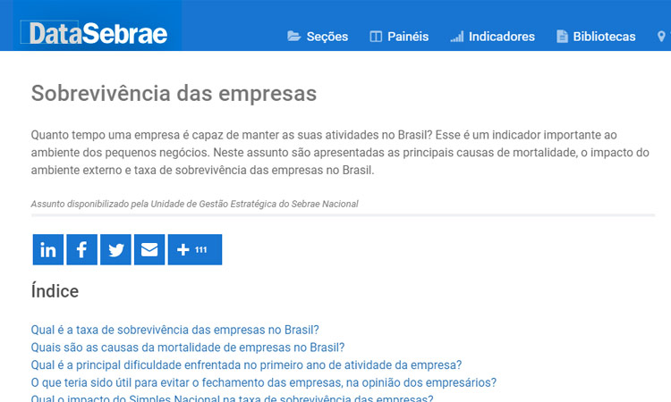
We also don’t use dates in the titles. Like, “Inflation in 2019â€. The idea is that we always have the most recent information available on every page, and we also keep older reports in the end, to maintain history. Notice that the manner how titles are written is under further rules, they keep things easily comprehensible and reduce the trial and error behavior on the navigation.
2) All the content is broken into questions and answers
We have many different reports about the profile of entrepreneurs, for example. And, in the first instance, users don’t care about it. They only need to find answers about the profile of entrepreneurs, and that’s why we create a single page that combines all the documents from this subject. We do that by listing all the questions and answers brought by those reports. And that’s it: see the question, click, and get the answer.
3) Too many topics require supertopics
Too many questions are also not so easy to read in a list. To minimize the negative effects of this big amount of information, we split the questions into bigger topics. For example, when talking about the profile of individual entrepreneurs, we have 3 kinds of questions, the ones about demography and behavior, the ones about benefits of formalization, and the ones about financial education.
4) First, you see the answer to the question, and then the analysis
It happens all the time. You see the title of an article, it makes you curious, and going there, the answer is just after a long and slow story that you don’t need. We don’t do that here. The answer always comes first, and then we can aggregate some analysis, with graphical representation.